Commissioned by: pro Real GmbH
Year: 2015 – 2016
Location: Wesenufer Hotel & Seminarkultur an der Donau
Format/Technique: Exterior design; floor, seating, and playground objects, graphic design, upcycling;
photo documentation
Material: FunderMax panels, sand, wood, foil print on lamps, furniture, herbs
Cooperation: Realized by companies and production locations of pro mente OÖ, ATZ Holzwerkstatt Linz and
ATZ Zweigstelle Schwaigau, Asten.
IN THE PARK
The strength of artistic design processes is evident in the intensive engagement between artistic proposals
and the commissioners’ ideas of design. Part of this is entering into the process and not evading the oppositions and contrary ideas, but rather using this energy to achieve a high level of quality together. The design
of the outside area of the Wesenufer Hotel & Seminarkultur an der Donau (EN: Seminar & Hotel Culture on the
Danube) shows a process of exchange extending over almost a year and the periodic re-invention of specific
arrangement possibilities for the terrace and the grounds extending toward the Danube, to make it possible
for guests to use them. KunstRaum Goethestrasse xtd worked here for the first time in an outdoor area and
accordingly collaborated with craftspeople and experts for materials.
Over a period of several months, the proposals for a garden area for short breaks and conference visitors were
transformed in the process together with the commissioners in the direction of a multi-use space for seminar
and event guests as well as for day visitors. During the day as well as in the evening, the area should invite people
to linger, relax and exchange. It should also be possible to expand it into a restaurant area as needed and be integrated into the everyday operation of the hotel with as little effort as possible. The visibility of the grounds of the
hotel should also be enhanced through the artistic design. The realization resulted in a mixture of self-produced
elements, individual pieces adapted and built by the craftspeople, and purchased furnishings. The design achieved
a balance of an homage to nature and art, which was reflected in the selection of colors, forms and materials.
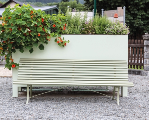
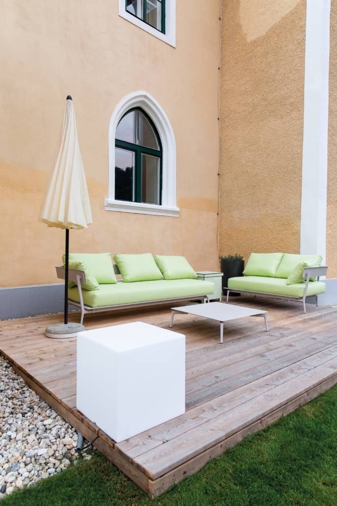
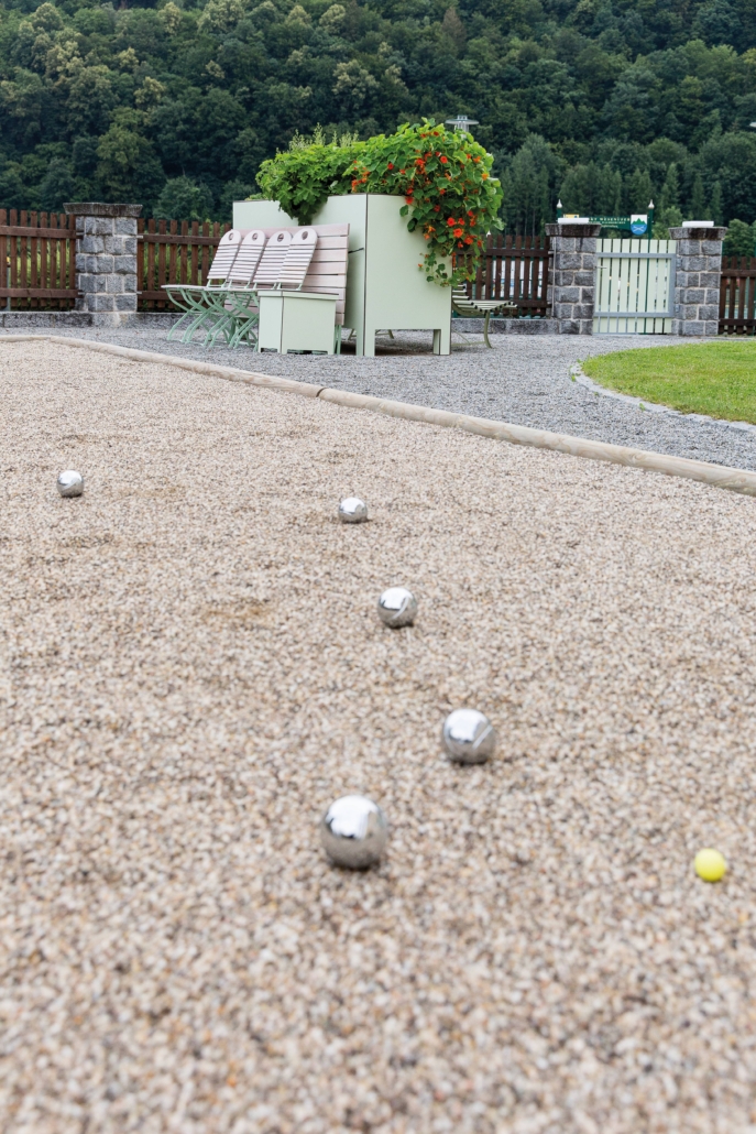
The realization included seating areas with tables, a lounge area, a terrace made of larch wood, benches,
playground elements, a boules lane, light elements, book crates and herb crates as design elements. Adaptation measures including cutting the wooden fence in half, which had almost hermetically closed off the beer
garden. Reducing the wooden fence by half and decorating it with flower boxes resulted in opening the area up
and making it more visible. Wooden elements were designed in a shade of green that does not occur in nature.
In contrast to the color design, the presence of herbs adds a visual and olfactory highlight of nature throughout
the grounds. The boules lane was filled with sand, so that it does not look like a playground at first glance.
The outside area presented challenges for an artistic design to make it recognizable as such. In this way, the entire
area was changed and could be experienced in a new way, instead of simply being decorated with artworks.

